Wednesday, February 25, 2015

Vancouver Shops + Stops | Part Two

From September 2014...

Continuing on where I left off yesterday with a selection of Vancouver design stores... starting the tour in the east, on Main Street, before heading into the city of Vancouver.


If you ever had a pen pal as a child, you will love The Regional Assembly of Text!  12 year old me would have loved the button making station, or the typewriters set up to type a letter to a friend.  (Let's be honest, grown up me thinks it's pretty neat as well!)  There are quirky postcards and original cards for sale, as well as a tiny nook for reading tiny books.  And yes, they have a letter writing club as well.  Adorable.

The Regional Assembly of Text
3934 Main Street, Vancouver, BC
www.assemblyoftext.com


Further down Main Street is the adorable home store, Nineteen Ten.  You will find a mix of vintage, up-cycled, hand made and modern homewares here, including purses made from vintage, iconic Hudson Bay blankets, timber and marble chopping boards... plus it was exciting to see they stock Turnco Wood Goods made by some personal friends.

Nineteen Ten
4366 Main Street, Vancouver
www.nineteenten.ca


Also on Main Street is my personal favourite, Vancouver Special.  (The store derives its name from home from the period of 1965-1985... basically a two story rectangle box with a low pitched roof, balcony stretching across the second level at the front, brick exterior on the lower level and stucco exterior on the second.)  Vancouver Special specialises in contemporary furnishings including Muuto, Norman Copenhagen, Alessi.  They also have a wide range of design books which can be very dangerous if you love design and books!

Vancouver Special
3612 Main Street, Vancouver
www.vanspecial.com


Love eclectic cafes?  Love window shopping for handmade items while you eat?  If so, then Le Marche St George is where you will want to be.  A short walk from the shops on Main Street, Le Marche St George is perched on the corner of a residential neighbourhood.  Pastries and other treats are served up on silverware, just begging to be Instagrammed!

Le Marche St George
4393 St. George, Vancouver, BC
www.marchestgeorge.com


While waiting for a table at Catch 122 just next door, we popped into Stylegarage on West Hastings.  I loved the thread of Canadiana that runs through their products; from their furniture being signature, made-to-order, to the Prairie tables (yes, three individual tables in the shape of Alberta, Saskatchewan and Manitoba, click here to see them), to the stylish cushions by Nicole Tarasick.  I don't know why I walked out of the store without buying the YVR cushion, but have since discovered that they are also available through Etsy should you not be able to get to the store.  I'm always on the look out for beautiful table lamps, as I find them hard to come by... they stock gorgeous ones by Caravan Pacific.  Sadly, because of the voltage in Australia, I couldn't bring one home. :(

Stylegarage
124 West Hastings Street, Vancouver, BC
www.stylegarage.com


This trip I discovered that Gastown is undergoing a home renovation, quite literally!  Parliament is another homeware store in the area, specialising in modern furniture and furniture for small spaces.

Parliament Interiors
115 Water Street, Vancouver, BC
www.parliamentinteriors.com


Saving the best for last is the beautiful Old Faithful Shop, also in Gastown.  It occupies the space of a landmark building.  Original industrial detailings have been maintained and black and white photography of life in 1900s Vancouver decorates the back wall.  Enamelware, glassware and pottery lining the wooden shelves with the brick wall as a backdrop is a visual feast.

Old Faithful Shop
320 W Cordova St, Vancouver
www.oldfaithfulshop.com


 After all that shopping, you will need a pick me up!  Revolver Coffee is just around the block from the Old Faithful Shop.  Though I don't know how relaxing it is, because they are pretty serious about their coffee!  (How gorgeous is that mosaic tile... found on the floor as you enter the toilets.  Yes, design inspiration can be found anywhere!)


Revolver Coffee Inc
325 Cambie St, Vancouver, BC
www.revolvercoffee.ca

One more store I wanted to mention, though I didn't get any photos of it is The Cross... which is truly a destination for all things home, as well as baby, cards, and they have a fabulous selection of ribbons.
The Cross Décor & Design
1198 Homer Street
www.thecrossdesign.com


Vancouver Shops + Stops | Part One

From September 2014

Vancouver Shops + Stops | Part One

It's not often you hear of people escaping a chilly Australia for a sun-drenched Canada, but that was exactly what I did when I visited my old hometown of Vancouver in July for the first time since departing two and a half years ago.  Vancouver summers are just delightful with their long, warm days, sun-drenched patios overlooking the water... and I had forgotten how gorgeous the hanging baskets are!

Even though it was predominantly a family trip to tie up loose ends, I made some time to check out some shops and cafes for design inspiration.  It's a big post, so it has been roughly divided into two parts; east and west.  This post focuses on the east; from UBC to South Granville.


While exploring outside the Museum of Anthropology, I came across an event being set up.  I wanted an invitation to a party that involved tents, lanterns and scatter cushions!  How gorgeous would it be when the sun went down and you would have the lit interior of this Arthur Erikson designed building as your backdrop?

Museum of Anthropology
6393 NW Marine Dr, Vancouver

www.moa.ubc.ca


Having had fallen in love with Butter Baked Goods before I left, I had to visit the new cafe on Mackenzie Street this visit.  The interior of pistachio green joinery and pink tea rose wallpaper brings back nostalgic memories of visiting grandma, as does the delicious bars and marshmallows.  I was given the Butter Baked Goods cookbook as a gift... the cupcake recipe with its tips including using pastry flour and sifting ingredients onto parchment paper makes you feel like you are baking like a pro.  Oh, and the cupcakes are so amazing, they almost do not need icing.  Almost!

Butter Baked Goods & Cafe
4907 Mackenzie St, Vancouver, BC V6N 1G8, Canada
www.butterbakedgoods.com


I had driven past this brick apartment building at 12th and Granville for years, often admiring the terracotta pots of flowers hanging from the windows.  I had almost walked by again, but window boxes of petunias in the window of the restaurant at ground level caught my eye.  Upon closer inspection, I noted that the restaurant had undergone a renovation since the last time I was in town.  I had to have lunch just so I could sit and take it all in.  The kale Caesar salad did not disappoint either.  In fact, it was the single most delicious salad I have had in a long time.  Homemade Caesar dressing and cornbread croutons will turn you into a kale lover.

For more photos of this stunning interior, click through to this blog post from Pine Cone Camp.


No trip to South Granville is complete without stopping by Peridot for some design inspiration.  Glamourous, shiny, sparkling neutrals fill every corner of this tiny interior design shop.
Peridot

South Granville
512 West 14th Avenue, Vancouver
www.peridotdecorativehomewear.ca

 
After all that exploring, you will need an afternoon pick me up.  Thankfully, there is never a Cactus Club Cafe too far away.  The Raincoast Greens salad is welcome sight to any traveller whose eating habits are all over the map.  The ceviche, pictured here, is refreshing as well.

Cactus Club
Various locations
www.cactusclubcafe.com

Sunday, June 15, 2014

Concept Board: Anchor


I have just realised I am halfway through my interior design course and haven't shared anything yet!  Unlike my first courses where I was oversharing.  Here's an image of my concept board for my house design.  Now, that may be why you haven't heard from me... I have to design and spec the interiors for a four bedroom house.  Not feeling panic at all!

I do like the concept board approach... it conveys your vision for the project, helps you stay on topic and helps you come up with original ideas.  I have so many ideas brewing... I had better go get them down on paper!

Thursday, December 12, 2013

The Merry Rose - Cafe

I keep meaning to update this blog with my commercial café assignment.  As it turns out, I won the Highly Commended Laminex Commercial award for this design last night, so thought I had better get it posted, pronto!
When we received the plans for the café, I noted that the layout was similar to the café that is located in Lyne Park, Rose Bay (just down the street from me). I decided to locate the café there (the joys of imaginary clients!) and the rest fell into place!

The back story to the commercial café design was a family who had worked in the restaurant industry and now wanted to open their own restaurant.  I decided that my family should be transplanted Americans (again, taking creative liberties!).  There is a large representation of different nationalities in the food industry in Sydney, yet not so much American food, not counting fast food.  American food from the South would work well in Sydney, given that they are both similar climates.  The menu was the first thing I developed.


Lyne Park is located on the edge of Sydney Harbour, so it has the double treat of a leafy park on the water's edge.  In doing my market research, Rose Bay has a couple of high end restaurants in The Sailor's Club and Catalina, and numerous coffee shops and take away shops.  What it is missing is somewhere in the middle, where families and people can gather to relax and enjoy the scenery.  Inspired by the harbour setting and the leafy park, I settled on a "Nautical Picnic" theme.

The setting:

 
The inspiration:


Picking a colour scheme was the next step.  Navy was the obvious given, being the official nautical colour!  Inspired by the blue and orange in the previous Temple and Webster styling assignment, I added orange to the scheme, along with a touch of aqua.  Also, subconsciously, I think I was inspired by American sportswear designers Tommy Hilfiger and Ralph Lauren.  (Funnily enough, post assignment, I was walking through the mall and spotted the orange and navy theme in the Ralph Lauren window!)
 
A few months ago, we had a school excursion to Materialised, who design and print commercial fabric.  We were shown how we could design our own fabric using Dulux colours to match.  I then designed three different striped fabrics for picnic rugs and cushions using Dulux colours; Flamboyant Orange, Blue Mercury and Royal Battle.
 
The rest of the design unfolded from there:
Jardan for picnic tables, café tables and bench seating.
Di Lorenzo for a fabulous timber tile and subway tile behind the bar. 
Like Butter wooden milk crates assembled into storage shelving behind the bar. 
Basil Bangs umbrellas for the terrace. 
 And my personal favourite... Walk the Plank for the bar stools.  (A local Sydney company.)
 
And the name... some quick brainstorming with some friends (I am fortunate enough to have some intelligent friends!) and the name "Mary Rose" came up.  The Mary Rose was Henry VIII's battle ship.  (Though the Mary Rose was sunk in battle... hopefully my café fares better than that!)   A quick switch of Mary to Merry, and The Merry Rose was launched!
 
The final design... apologies for the iPhone pics... grabbed quickly before it was handed in!


And finally, I even specified that the staff would wear navy Sperry Topsider shoes... of course they would!


Thursday, November 14, 2013

Temple & Webster Assignment


Whoops... forgot to blog this one - I only completed it about a month ago!  Temple and Webster is an online store and they shoot their product in house.  As a class excursion, we visited their offices, had a presentation on styling and photography and were then given a brief to work to.  Included in the brief were two cushions we had to sell.  We had to design a scene around the cushions, source props and then design that scene.  It was a contest, and the winner one a week's work experience at Temple and Webster.  I didn't win... but did find it a very useful exercise in planning and creating a photo shoot.  I will let the pictures and board tell the rest of the story!
 

Tuesday, November 12, 2013

Bathroom Assignment

If you have been wondering where I have been... well, I have been working on this bathroom assignment, so expect miracles!

The brief was to design a bathroom for a busy working couple in their 30s.  They wanted something luxurious, but also easy to clean.  Separate basins were also required as was a bath tub.

My starting point was concrete tile that I sourced through one of the tile suppliers who supports the school.  This tile is gorgeous... in situ, it looks like concrete formwork. Yes, I have developed a love for concrete thanks to swimming pool design days!  Actually, swimming pool design practice came back to me while working on this project. We used to consult with architects on change room layouts.  Two things I applied to this project were small mosaic tiles for the floor (small tiles allow for more grout lines to create grip for bare feet) and separating the space into wet and dry areas.

In reviewing the layout, I realized I had the space to separate the space into male and female sides, therefore meeting the brief for separate basins.  While sourcing the concrete tile (which was to be used as a feature wall on the female side), I also fell in love with some marble tile, which had some grey through it which linked with the concrete tile.  The octagonal marble tile was to be used on the floor, and the square tile to be used on all vertical surfaces and in the walk in shower.  Around this time, I had seen a Jamie Oliver food video where he had a timber bench top... and I had to have that too!  Slowly a palette developed into what I unofficially called "rustic luxury".  The design developed into rough and smooth, light and dark, squares and curves, old and new; his and hers.  (I titled it 'lui et elle' because with the addition of the Bentwood chair on the mosaic tile, it reminded me of the French bistro in Sydney CBD, Felix.

Some detailing bits: the shaving mirror over the male sink is rimmed and hung with a brown leather strap, the square vessel sink sits on a walnut bench top, there is a window over the tub which looks out onto a private garden (with high walls and a locking gate!), the female bench top is sparkling white Corian with integrated sink; the make up counter to the left is also Corian and connected to the bench space, a walnut Bentwood chair for use at the make up counter, the mirror over the female sink has integrated LED lighting and the ceiling light is an Italian glass chandelier.  (You have to love clients with deep pockets!)

If I have missed any details, I am sure you can piece them together in the images below.  Now, I only hope I can put as much detail into the commercial space that I have to design by the end of next week; of which I have barely started.  (I feel panic setting in!)


Wednesday, August 28, 2013

Lounge and Dining Rooms

The wait is over... the highly anticipated, much agonized over, lounge/dining assignment is here.  Only took some 90 hours of sourcing, paperwork, hair pulling, teeth gnashing glee to pull it all together!  Should get easier from here on in!

Client Brief

Busy couple with two children
They have travelled extensively and particularly love... (I chose Morocco). They have collected many treasures from this area which they would like to incorporate into the new, contemporary scheme.
Mood required - warm, modern, individual.
Colour palette - in the mid tonal range.  They like richness of colour and texture and don't mind feature walls or wallpaper.  They don't want an overall scheme that is too neutral.
They love good food and entertaining friends., enjoying the alfresco lifestyle in summer.
A more intimate atmosphere - possibly with a sense of drama in the dining room - is required for winter and more formal dining.

I created cupboards for storage and entertaining along one wall, opened up the rooms to the enclosed terrace with bi-fold doors.  That way the children and their puppy (!) can move freely within the space.  The front door opened straight into the playroom, so I added a console, stool and coat rack for guests to place their things.  The drama in the dining room is that spectacular table... and large mirror reflecting the lemon tree outside.  The rest is self-explanatory, I hope!

I love these colours... Porter's Paint Bee's Knees and Dulux Milton Moon... and plan to paint some chairs very soon to see how the colour turns out when painted!

PS... these look much better in person, so if you ever want to stop by and take a look... let me know ;)


Monday, August 26, 2013

(Infamous) Chair Assignment


First published June 28, 2013

If you are following me on Facebook, you will recall I inundated my newsfeed for a while about my chair assignment for school!  We had to research 16 chairs over time... I started with the Louis chairs, through Art Deco and Art Nouveau to modern chairs.  It was such a great learning experience.  Not only did I get a real grasp on the chair designs, I learned some history, politics and goss at the same time!  (Le Corbusier drowned in the sea in front of Eileen Gray's house in the South of France!)
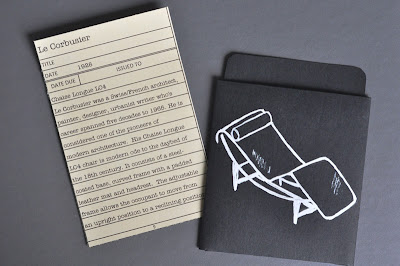
I went with a library theme for the assignment.  I wrote up the 'library cards' in Excel and printed them on cream card stock.  For the 'library pockets', I traced a template out onto black card stock, cut them out, folded and glued them together.  I drew in the chairs on the front of the pockets with a white gel pen from Kikki K.  I had to buy a mug from Kikki K in order to get a box the right size to fit the cards.  I covered it in craft paper and added the label.  And yes, that is the Dewey decimal number for chairs.  (At least it is according to the Internet.)

I wouldn't have considered drawing the chairs a year ago... but that's the 'willingness to try' that I have learned since starting at ISCD!  There are 16 chairs, but I've only photographed some of them, as seen below.  Some others are a bit dodgy, to say the least.  Let's just say, if I ever need a chuckle, I can always pull out the chair assignment box!

Since I spent so much time and energy researching and writing about chairs, I have included the writings from the cards following the images.

Next assignment is Lounge and Dining... just have to get all the ideas out of my head and on to paper!


History of the Chair
1. Louis XIV Baroque
France, 1643 - 1715
Louis the 14th, aka Louis the Great, ruled France for 72 years, 110 days. Louis was a great patron of the arts. He supported artists and craftsmen. It was he who increased a hunting lodge built by Louis XIII into the magnificent Palaceof Versailles. Furniture from this era is marked by heavy, masculine forms, opulence and great volume. Chairs were formed with curved or turned legs, straight backs, fixed upholstery in tapestry, brocade or velvet and had carvings of mythology and acanthus leaf.
2. LOUIS XV - Rococo
France, 1723 - 1774
The heavy, masculine furniture of the Baroque era gave way to the lighter, more feminine Rococo era. Stretchers were removed from chair designs. The curved cabriole leg and scroll foot were used at length. Common back styles included round, crossbow, central indentation and double indentation. In keeping with the elegant lines of the era; shell, flower and plant decorations were used as well as C scrolls and S scrolls.
3. LOUIS XVI - Neoclassical
France, 1774-1792
Inspiration for the Neoclassical era came from the discoveries at Pompeii andHerculaneum. Marie Antoinette was the wife of Louis the 16th and had great influence on furniture at this time, having had smaller pieces designed for her rooms at Versailles. Greek influence meant a turn from feminine curves to straight, angular lines. Chair design was restrained: seat backs were medallion/oval shapes/square-backed fauteuil. Fluted legs, carved friezes, the Greek band, oak and laurel leaf dominated the designs.
4. Victorian
England USA, Australia 1837-1901
The Victorian era was a time of great change. The design world exploded with all sorts of products based on cultural influences and new technologies. One chair that rose from this time is the
Bentwood chair. Its shape borrowed from the natural world that influenced design of this era; its construction owed to the advancement in technology. Thonet’s No. 14 was made up of six pieces of steam-bent wood, ten screws and two nuts. The Bentwood, or cafe chair, was the start of mass-produced chairs.
5. Arts & Crafts
1860-1910
The Arts & Crafts era was a backlash response to the Victorian era and the Industrial Revolution. Mass production was putting the remaining artisans out of business. Arts & Crafts could be best described as handmade items inspired by nature. William Morris was the artist and writer who founded the style. Perhaps the most iconic piece and copied of Arts & Crafts movement is the Morris chair. The design features a reclining back and high, un-upholstered arms. The seat back and seat have unattached cushions.
6. Art Nouveau
1890-1910
Art Nouveau rose out of France at the end of the 19th century. It is a decorative style; inspired by nature and characterized by swooping curves, stylized organic forms, dreaming women with long hair. Art Nouveau furniture was slimmer and lighter than its Arts & Crafts cousin. It was made of sleek wood, and often detailed the sweeping lines of plant stems and grasses reminiscent of the Art
Nouveau artwork.
7. Art Deco
1910-1930s
Art Deco can be found in the golden period between the two World Wars. Travel was on the rise and was a strong influence on design. Art Deco's strong geometric forms most often looked likethey were going somewhere. This is representative in the Wassily chair by Marcel Breuer at Bauhaus. The triangular seat and square frame give motion to the shape. (This chair was inspired by the seamless tubular steel of Breuer's bike, and was originally held together with canvas straps; later replaced with leather.
8. Marcel Breuer
1928
B32
Hungarian-born Marcel Breuer was trained in Bauhaus techniques. Breuer worked with tubular steel in furniture design. The B2 chair, or Cesca side chair, is a iconic example of his work with tubular steel and cantilever mechanisms. These technologies allowed him to push the boundaries of chair design; negating the need for 4 legs and allowing for a modern, clean line in chair design.
9.  Le Corbusier
1928
Chaise Longue LC4
Le Corbusier was a Swiss/French architect, painter, designer, urbanist writer whose career spanned five decades to 1965. He is considered one of the pioneers of modern architecture. His Chaise Longue LC4 chair is modern ode to the daybed of the 18th century. It consists of a steel-coated base, curved frame with a padded leather mat and headrest. The adjustable frame allows the occupant to move from an upright position to a reclining position.
10. Mies Van Der Rohe
1929
Barcelona Chair
Ludwig Mies Van Der Rohe was a German-American architect. Along with Le Corbusier, and others, he also pioneered modern architecture. He designed the Barcelona Chair along with Lilly Reich for the International Exposition in Barcelona. With its steel frame and sloping tufted seat, it remains a modern design classic to this day. The original chairs had reflective chrome legs and ivory pigskin cushions, but was later redesigned with a stainless steel frame and bovine leather cushions.
11. Charles & Ray Eames
1950
DSX Dining Chair
Charles and Ray Eames were a husband and wife design team. They initially designed using molded plywood, but moved on to pioneering technologies with fibreglass and plastic resin. The Eames' were interested in creating high-quality, low-cost mass marketed chairs. The DSX Dining Chair was a molded plastic side chair; a runaway success which remains popular as a dining chair to this day.
12. Eero Saarinen
1955-6
Tulip Chair
Eero Saarinen was a Finnish-American architect and industrial designer. He was a close friend and partner of the Eames'. His Tulip chair is an iconic, futuristic piece. It is also molded to the human form; a simple tulip shape belying a more complex construction of fibreglass, aluminum and plastic. Saarinen wanted to create a clean, classic piece; a chair without four legs as he thought the legs to break up the clean sightline of modern design.
13. Arne Jacobsen
1958
Swan Chair (Egg chair/Swan sofa related)
Arne Jacobsen was a Danish architect and designer. His designs are simple, classic and elegant. This is evident in the Swan chair, which he designed in 1958 for theRadisson SAS Royal Hotel in Copenhagen. With organic, sweeping curves creating the armrests and the back; no straight lines were used in this chair design. The chair's shell is made of a molded synthetic material covered by a layer of cold foam, and sits on an exposed satin- polished aluminium base.
14. Verner Panton
1968
Panton stacking chair
Verner Panton was a Danish furniture and interior designer. He envisaged a chair without legs! With advancement in plastics, his design idea was brought to fruition. The curved, cantilevered chair made from one continuous piece of plastic caused a sensation when it made its first appearance in the Danish magazine, Mobilla. The materials of the chair have gone through several formulations to reach the current sleek design of rigid expanded polypropylene with a lacquered surface.
15. Marc Newson
1986
Lockheed Lounge
Marc Newson is an Australian industrial designer with international recognition. He practices biomorphism design; which is to take naturally occurring shapes and push them to their limits. The Lockheed Lounge echoes the daybed of the 18th century, and even Le Corbusier's Chaise Longue LC4. The lounge looks like a cross between a blob of mercury and the body of an aircraft. Following its appearance in Madonna's video, Rain, the aluminium chair became a collector item.
16. Philippe Starck
2003
Ghost chair
Philippe Starck is a French product designer. With his Ghost chair, the design has come full circle back to the Louis chairs of the French monarchies. While the shape is decidedly 18th century, th technology is definitely 21st century. The Neo-Classical chair shape is constructed in clear plastic; a ghost of the royal courts of a long extinct French monarchy.